We have a love/hate relationship with executive summaries. On the surface, they’re a great idea. What’s not to love? You’ve spent hours or days developing a high-stakes presentation that tells a great story. And now, with that first slide you flash to your audience, you’ve boiled it down nicely to just one, condensed summary. Your busy retail partners – with five more meetings lined up that day – get a sneak peek of precisely what you want them to know or do. All the juice up front! Perfect.
But of course, it’s never that simple.
A poorly crafted executive summary is a missed opportunity to drive business forward
Here’s the hate part: Even the most well-crafted stories, distilled down into one page, can easily turn into a crowded, impossible-to-digest data dump. Cross-functional teams at consumer packaged goods (CPG) companies face the daunting task of distilling vast amounts of data into actionable insights. Retailers often expect to begin meetings by getting an overview of the main category and its composition – typically via an executive summary. But with so much data to share, the challenge is to highlight the most critical information without overwhelming the audience – especially when you only have one page (or slide) to do it.
This is made even more difficult by the fact that CPG teams often present to busy executives and stakeholders with limited time. To make the most of everyone’s time, the goal is to have a two-way dialogue, not to explain busy charts and text-heavy slides. When meetings turn into tactical or transactional exchanges, objectives don’t land and decisions aren’t made. Ultimately this leads to yet another meeting and a loss of productivity for everyone involved.
On the flip side, the ability to effectively net out your message and share insights needed to make informed decisions will have a huge impact on your success. Executive presence soars, critical initiatives move forward, and most importantly, trust and loyalty with retail partners grows.
This is where a well-crafted executive summary can make a difference.
Aim your executive summary squarely at your audience
The expectation of your audience should weigh heavily in how you craft your executive summary. For example, flashing it for 90 seconds as the first slide of your presentation might make sense for one audience, but a one-pager shared as a pre-read might be more valuable for another. Regardless of the form or layout, it’s crucial to keep the audience’s care-abouts top of mind.
Yes, you can absolutely tell a story on one page
Brain science tells us that organizing your ideas and data into a story will help your audience remember your message. And an executive summary is the perfect opportunity to tell a story on one page. As a reminder, the essential elements of a story are setting, characters, and conflict (the WHY of your story); a BIG Idea (the WHAT of your story); and resolution (the HOW of your story).
CPG leaders often struggle to highlight conflict in their presentations – whether it gets buried within slides or not shown at all. There’s a tendency to focus more on setting and characters while shying away from sharing conflict or challenges, due to the perception that it signifies a loss or failure. But the reality is, conflict is crucial because it gives you the chance to reveal opportunities and recommendations on how you’ll address it.
Applying a storytelling framework to executive summaries empowers CPG leaders to be bolder in not only presenting conflict, but also how to solve for it.
The question is, can you build a compelling executive summary that fits all these elements into one page and not become a jam-packed mess? Yes. Let’s see how…
Example 1: State of the Category
Here’s an example of a typical executive summary from the category leadership world. This was a quarterly deliverable used to inform cross-functional internal teams as well as leadership on the State of Category X. The goal was to inform internal and external partners of upcoming headwinds and tailwinds within the Category, by sharing key takeaways and commercial recommendations.
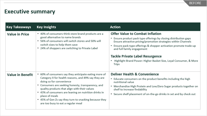
In the “before” version, the team focused on the “What, So What, Now What?” – which for them was a typical format for Executive Summaries. While all the content was there, it was difficult to pull out the key insights and call to action!
What’s not working? Here’s a marked-up version of this “before” executive summary slide:
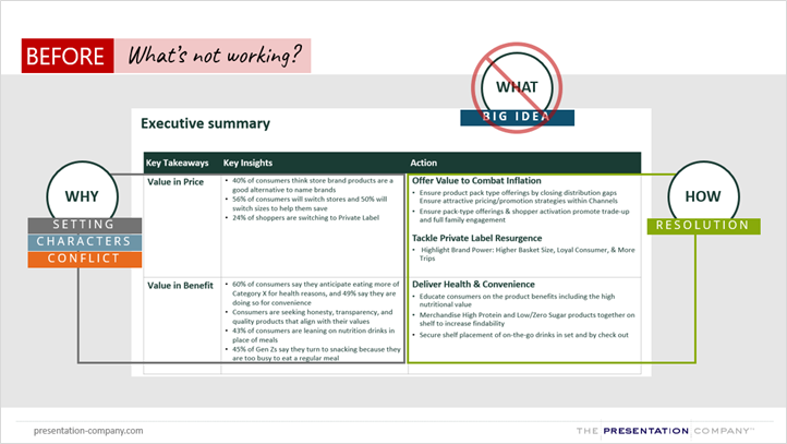
If we zoom out and look at this executive summary from a distance, here’s what’s evident: there’s a clear WHY and HOW but no WHAT! What’s the ONE THING the audience needs to know or do? The title is a missed opportunity to communicate the BIG Idea.
And yet, an executive summary is supposed to be a summary of an entire story! So right away, we can see this summary is missing critical storytelling elements to make it whole. Visually, the content is displayed in a table, but with no color to help break down the information, it makes it hard to scan at a glance. Color, oversized text, even a graphic or photo could help make the information more memorable.
Ready for some relief? Take a look at the “after” version of the same executive summary.
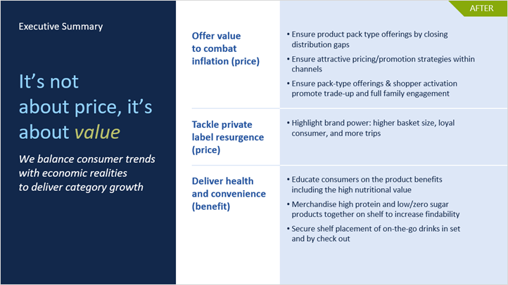
What’s working? Here’s a marked-up version of this “after” executive summary slide:
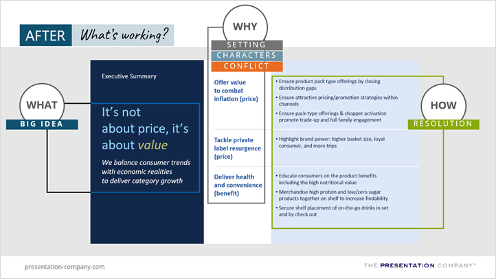
Notice how this made-over executive summary incorporates each storytelling element. The BIG Idea is on big, bold text on the left side of the page. Then on the right, we lead with the WHY, which establishes necessary context for the story. Finally, we have the HOW, or resolution. It’s also important to note that there is the main headline (blaring the BIG Idea) and another active sub-headline, working together to bring the story forward.
Example 2: Pre/Post-Planogram Analysis
Here’s another example of an executive summary. This was shared with a retailer category manager who requested a pre/post-Planogram analysis to help them talk to their leadership. This executive summary is unique in that it’s a look back – essentially an update on the impact of planogram changes.
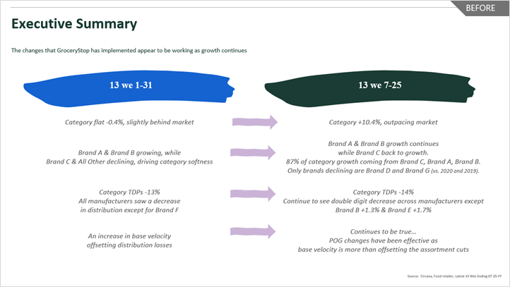
In the “before” version, the team tried to use color to break up some of the information, and arrows to indicate that the left was “before” reset and the right was “after.”
What’s not working? Here’s a marked-up version of this “before” executive summary slide:
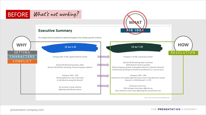
Performing a story audit on this executive summary, it’s evident that some important storytelling elements are missing:
- There’s no BIG Idea!!
- There’s no WHAT of the story on a page
Ready for some relief? Let’s move on to the “after” executive summary that tells a story.
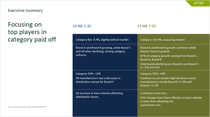
What’s working? Here’s a marked-up version of this “after” executive summary slide:
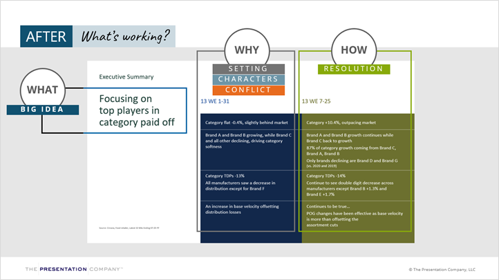
If we zoom out and look at the AFTER through the lens of storytelling….
- Notice the BIG Idea in big bold text on the left
- Color blocks are used to break down the information to make it easy to scan
- We kept “Executive Summary” in the title for context (and because we know some audiences still want to see it), but the eye is drawn to the most contrasted element on this slide – the BIG Idea (which is what we want)!
- The WHY is contained on the left in navy blue
- The HOW is contained on the right in green
Bottom line: The audience doesn’t have to work hard to interpret this story on a page! This “after” executive summary has a clear WHY, WHAT and HOW.
To Recap: Storytelling + Executive Summaries = ❤️
By applying effective story strategy, any residual hate feelings for executive summaries should tip in favor of love. Introduce just the key elements of your story, revealing glimpses of the WHY, WHAT, and HOW. Done right, this will pique the curiosity of your audience, compel them to lean in, and offer you the spotlight for your full story.


