Every day, data drives business-crucial decisions. When presented poorly, data can create confusion, leading people to misinterpret your message and stall decision making. But, when presented well, it illuminates your points and inspires action.
TPC’s Presenting Data Visually workshop arms teams with data storytelling best practices for creating compelling, easy-to-scan charts and graphs. We help storytellers transform their data findings into visually compelling insights that get remembered.
Whether you’re presenting data to provide an internal update, gain approval, or influence your next customer, we’ll help you turn your data insights into actionable recommendations that drive the conversation forward.
Learn How To
Tell the story behind your numbers by distilling facts and figures into clear, digestible, meaningful messages
Utilize visual techniques and design principles to communicate your insights with memorable impact

Empower your audience to quickly understand your message by transforming your data and insights into actionable recommendations
Walk Away With
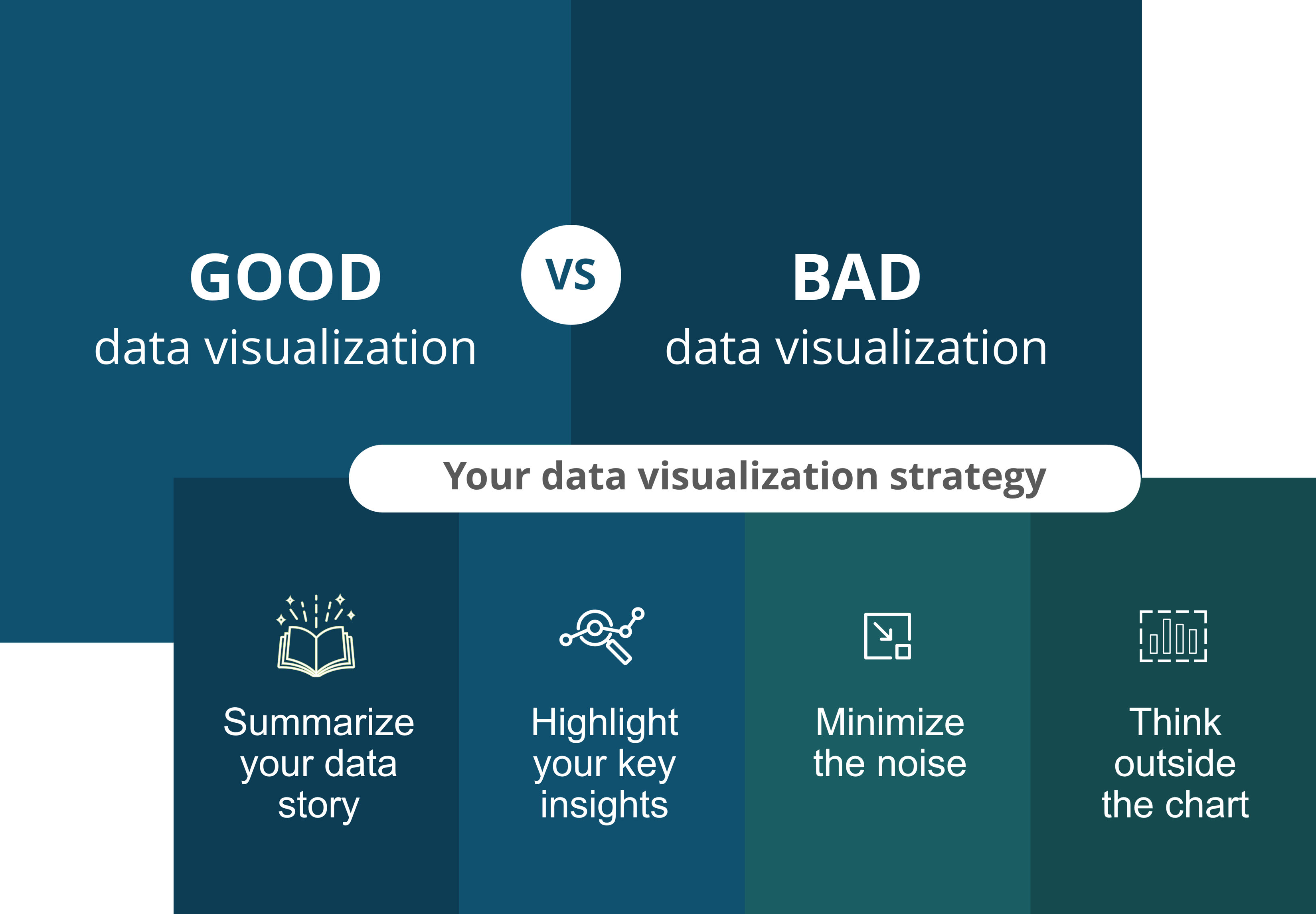
A Data Visualization Library
This suite of 100+ professionally designed data visualizations guides you through the five ways to display data and provides inspiration, pro-tips, and coaching examples to help make presenting data a quick and simple process
Strategies for minimizing clutter and “noise”
Get pro tips and tricks on how to clearly display your data and eliminate extraneous information
Simple design techniques to elevate your data story
Learn how to use color, size, and shapes to highlight key information and make data easy to interpret at a glance
Data visualization credentials
Earn a Certified Data Communicator badge and share your achievement with your social network


