
Thanks to today’s data-driven culture, we all live in dashboards. Whether you’re logging on to Salesforce, Tableau, Google Data Studio, or Power BI, odds are you spend a chunk of your work week reviewing and updating a series of charts and tables.
Maybe you’re using dashboards to track sales pipeline, marketing leads, customer satisfaction, or supply chain efficiency. No matter your role or industry, monitoring your KPIs is critical. And if you’re tasked with presenting or preparing dashboards for senior leaders, then you’ve got an added challenge on your hands.
But if your dashboard has become nothing more than a snapshot of numbers that gets refreshed – and no one sees the signal from the noise (HINT: they start to go into a daze), it’s time to switch up your approach.
Like them or hate them, dashboards can be extremely valuable. Having a way to efficiently and consistently track and visualize data is a critical part of any decision-making strategy, whether you’re tracking progress toward a goal or trying to spot problem areas.
But here’s the issue: Dashboards are limited by our ability to make sense of them. As with any business tool, they are only as good as the insights they provide and even more so, the results they produce. Once they become nothing more than static wellness checks, we’re missing the point. Data, when it’s useful, should lead to action – not fatigue.
Ultimately, for dashboards to be valuable, we need to be using them to talk to leaders – and not just data dump.
What is your dashboard communicating?
Although it may seem obvious, humans aren’t machines, which means we need to attach meaning to numbers if they’re going to be truly useful.
At face value, dashboards are a convenient way to view the most important data, but what they’re actually doing is giving us permission to stop thinking—and not always in a good way.
A well-crafted dashboard should be about more than just the data and reporting the news; it should be about what the data means and the story it’s telling. That’s where the value lies.
Here’s what we need to remember: Data on its own are not ideas. Data wrapped in a story – with insight and analysis, however, will provide the context you need to absorb what the numbers are actually communicating, which may inspire new ideas, lead to problem solving, and help with decision-making.
Bring your dashboards to life with storytelling – and spur business action
So, how do you build a narrative into your dashboards and, more importantly, optimize them to get the most value?
Here are five tips to help you bring your data—and dashboards—to life:
- Don’t make yourself (or your audience) work hard. Use active headlines and visual callouts. Also, reduce visual noise as much as possible, and choose graphics that show trends as clearly as possible. For example, bar graphs tend to highlight quantity differences better than pie graphs.
- Present your data with a POV. The dashboards themselves should be a discovery tool, not the final output on their own. Dashboards alone don’t provide value; they need a human to analyze it and provide insight. What message is the data communicating? What call to action is it prompting? It’s your job to make it make sense.
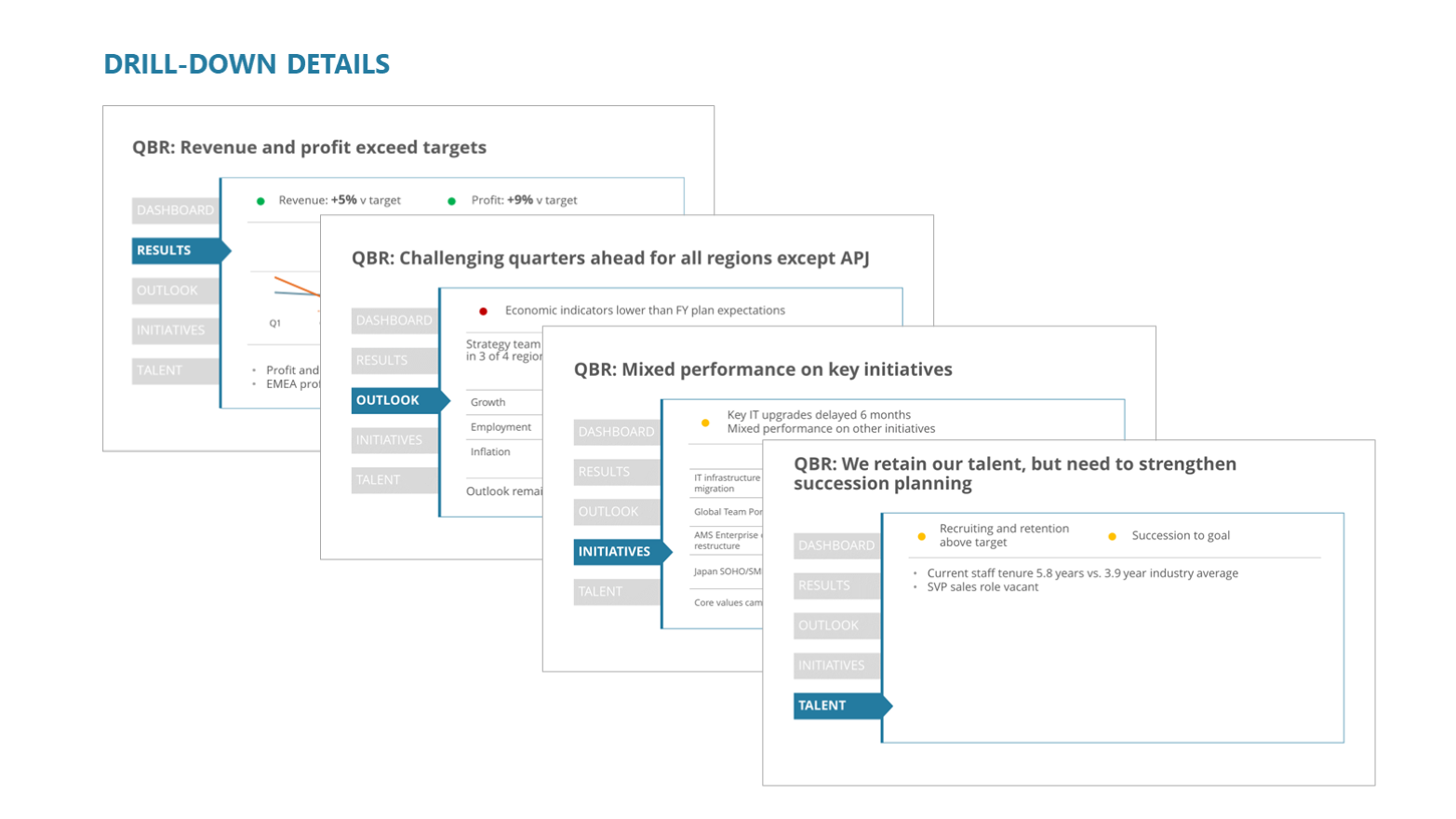
- More is not always better. Yes, even when it comes to data. Don’t overwhelm your audience with too much data. Be selective about what your dashboard is highlighting, and don’t be afraid to change it up as your business goals evolve. Instead of showing multiple charts on a slide, consider using drill downs to help focus your data story.
- Bolster dashboards on either end. Dashboards can’t stand alone—they require pre-work and post-work. On the front-end, understand and think about what you want to track first and why? In other words, identify where the data sits within the story. On the back-end, go beyond what’s on the screen and turn your numbers into narratives. Provide a call to action or recommendation based on what you’re seeing.
- Create a 2-way dialogue. Invite others to collaborate and explore your data with you. Dashboards provide a shared context that can help you discover new and profound insights, and strong storytelling sets the stage for these conversations to be productive and effective.
See it for yourself
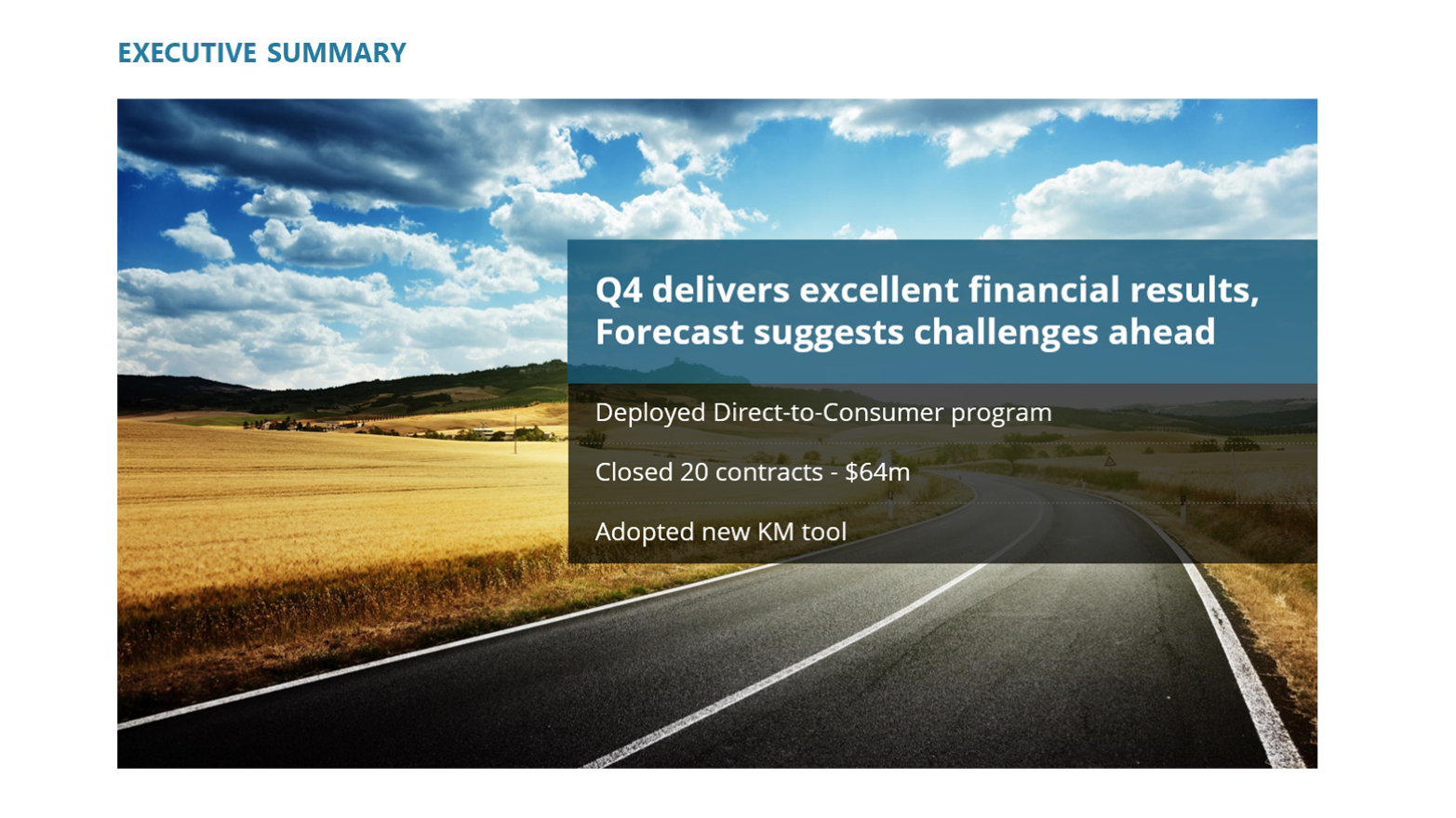
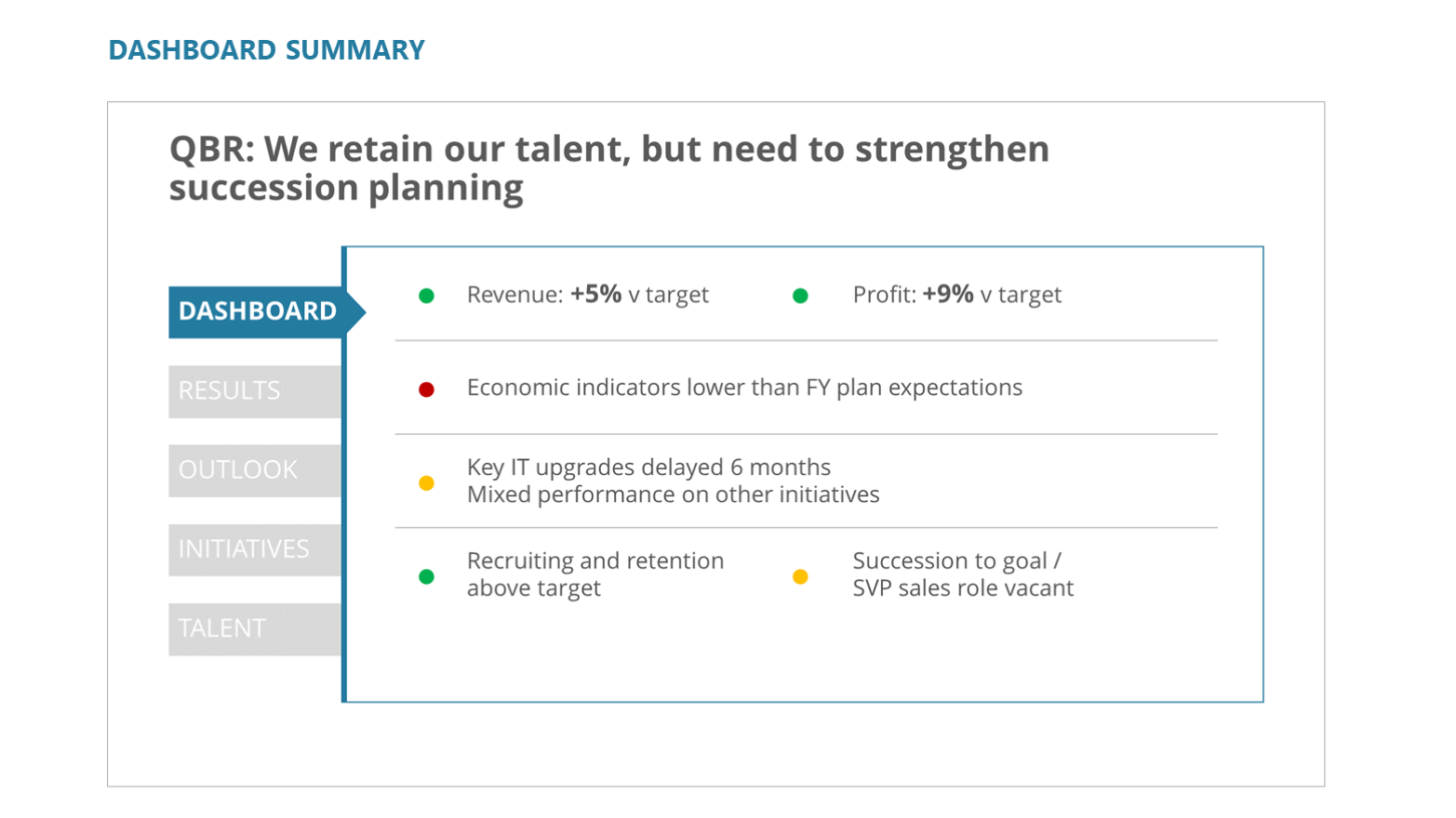
Here is an example of dashboard data that uses active headlines, visual callouts, and drill downs to help tell a clear and actionable data story.
 Put your data to work
When dashboards first arrived on the scene, businesses were hyper-focused on data quantity. Now, that focus has shifted toward data quality and analysis—and with good reason. Decision-makers don’t need data; they need insight. Dashboards need to follow suit.
If you want to make your dashboard work for you, it’s got to make sense. By being selective about your data, choosing the right visual cues, and adding context, your dashboard can evolve from a quick check-in tool to an indispensable business resource you can count on.