
Picture this: Your team is prepping for a presentation to win a big deal … or have a budget approved … or (fill in the blank). It should be wildly successful, since your team is made up of smart, talented superstars who bring loads of juicy data to the mix. What could possibly go wrong? A lot.
The presentation is jammed with text, bullets, charts and tables. When decision-makers should be wowed by all the valuable information flashed in front of them, they’re wrinkling up their faces in confusion and impatience. They miss the key message. The presentation lands with a thud.
For a presentation to be useful (i.e., to help an audience make a decision), it needs a succinct narrative supported by relevant data and purposeful visuals. There should be no extraneous information or visuals for the sake of visuals. In other words, you should ferociously edit the presentation.
Unsure where to start? Here are three simple visual tricks that will make your insights clear at just a glance.
1. Minimize the Clutter
Flashing slides in front of busy, tired or stressed executives requires you to think about where their eyes will land. One thing to keep in mind: the less clutter, the better. Do you need to include every increment in your axis and every single data point? Probably not. Perhaps measurements on a single axis could convey the message. And, if it is necessary to label every value in a chart, perhaps a table would be a more effective visual display.
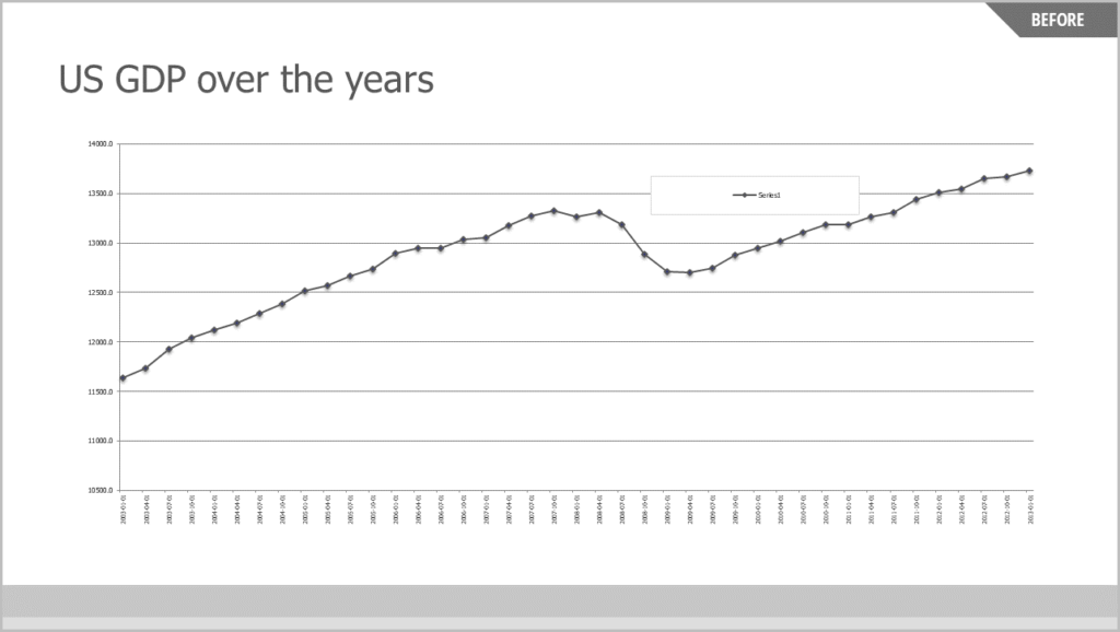
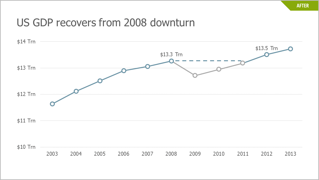
This chart uses annual averages to reduce the number of data points and simplify the x-axis. Remember: Always keep your data clear, concise and easy to interpret.
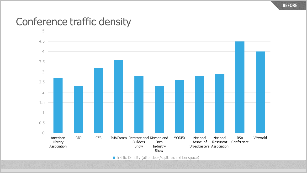
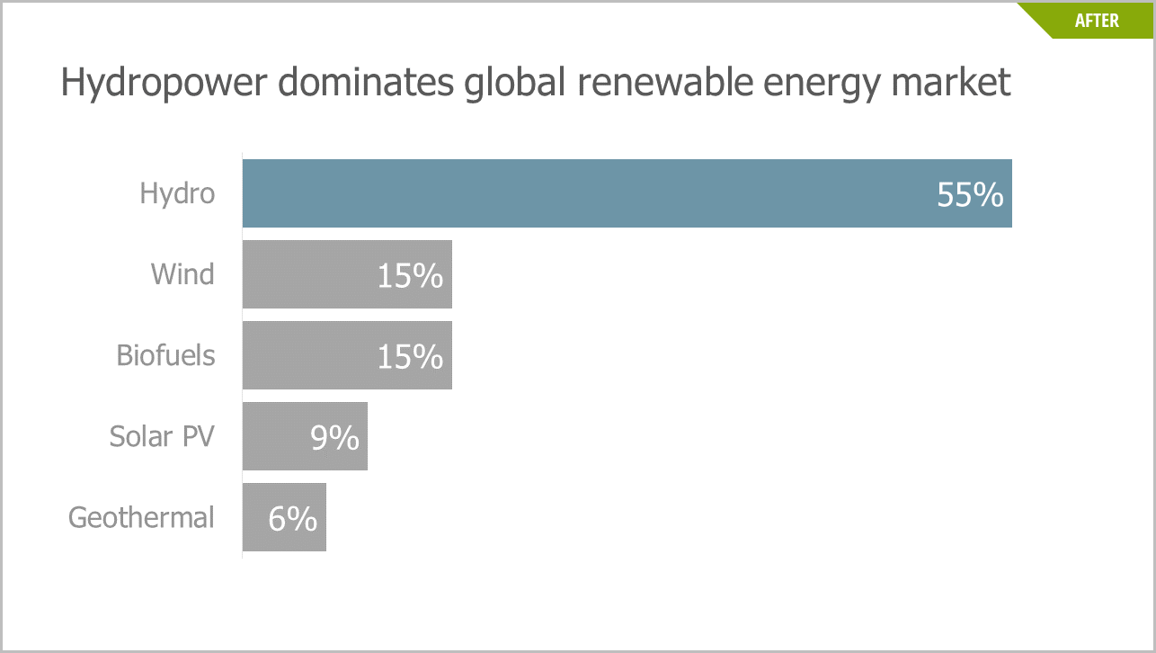
Another way to minimize slide clutter is to incorporate the legend into the chart. Including a legend as a separate element not only reduces the size of the chart, making it hard for the audience to read, but requires the viewer’s eyes to dance between the chart and legend to understand the data. Try using space inside your chart instead, like this example:

Tables and charts are often heavy on gridlines as well. Ask yourself whether you can subdue your gridlines (e.g., gray, not black, lines) or eliminate them altogether. Consider whether your chart actually needs gridlines to orient the data points or if the message is clear without them.
2. Craft Headlines That Tell Your Story
A powerful data storytelling device is to use headlines at the top of every slide. Think of each slide as a news story. Every news story has a title that conveys the single most important idea in the story. Put that title — the headline of the slide’s “news” — at the top.
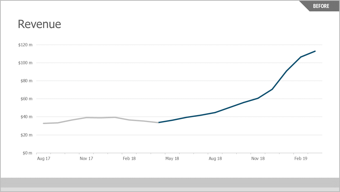
This headline is probably the first (maybe the only) thing the audience reads. A vague headline like “Q4 Update” or “Summary” provides no meaningful information. Which of these slides tells the audience more?
The first headline doesn’t say much, leaving the audience to decode the data for themselves. The second headline highlights the main insight, making it easy to scan and interpret.
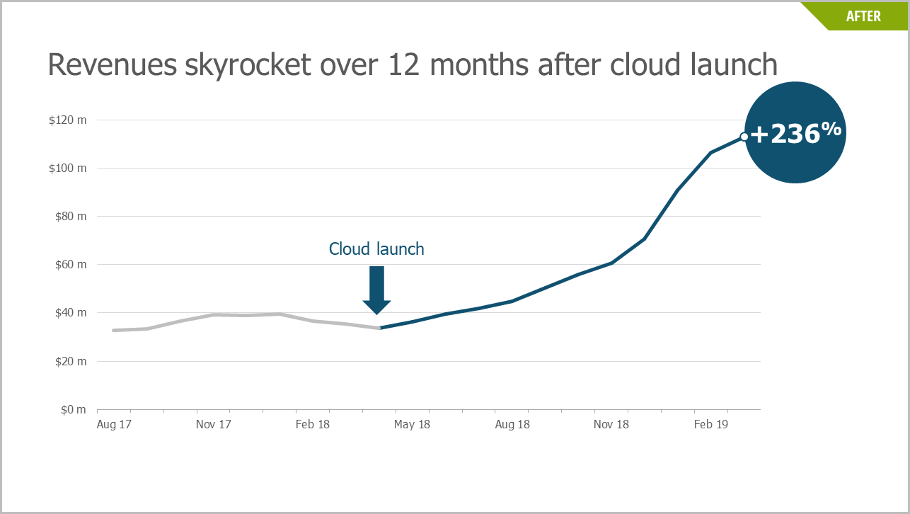
3. Use Visual Callouts to Draw Attention to Key Data
Callouts are an easy way to create a focal point for the key metric on your slide. They draw viewers’ attention using shapes, color and size. Callouts are particularly useful in visually “gesturing” to your key data point, particularly in conjunction with the slide headline.
Notice below how the first chart lacks a true focal point and a strong headline. The second, on the other hand, uses a blue arrow to call out the launch date and a matching blue circle to highlight the increase in revenue.
Two additional tips on using callouts: The callout should support the headline of the slide and should focus attention on one key message. A good rule of thumb is to never use more than three callouts per chart.
Keep the Visuals That Support Your Narrative, and Lose the Ones that Don’t
We must fight the urge to overload our audiences with rows of numbers, endless charts and tons of text. If we do, we will fail to influence those busy executives, customers or colleagues. Instead, it’s important to write clear headlines that advance our story and only include data that directly supports that narrative. Finally, using simple, uncluttered visuals will punctuate our message and give our ideas the opportunity to inform and influence decisions.
REPUBLISHED WITH PERMISSION FROM TRAINING INDUSTRY.COM