In a visual world where the pressure is on to choose the right image, chart, or video for your business presentations, what can help? Storytelling.
We’ve all felt the heat when putting together a presentation that’s meant to wow the room. In an increasingly visual world, where pictures and videos stand-in for written communication through our smartphones and laptops, visuals can act as a shortcut to convey information quickly to audiences with seemingly shorter and shorter attention spans. Think about the punchy billboards you drive by, a recent TED Talk with a compelling infographic, or a YouTube video that explains a complex topic with clever animation. Regardless of age, location, or culture, people express themselves through light, sound, and motion, which helps to explain why the human brain can process images 60,000 times faster than text.
But before you go on the hunt for “professional-looking” slides (the ones that have been reused and reassembled over and over in countless decks), or spend hours combing through stock photography and inspirational videos, remember that regardless of the visual choice of the day… every memorable presentation starts with a compelling story. We’ll be the first to warn you: more bright and shiny visuals are not necessarily better. You must choose your visuals wisely because, as amazing of a shortcut they are for getting people to understand and remember information, they’re only as good as what they’re shortcutting to –your ideas, insights, and recommendations.
This means pausing on what your presentation looks like and first focusing on the context, characters, ideas, and resolution that takes your audience on a journey. Remember, business storytelling isn’t much different from any other type of storytelling. Within every story is a simple framework. A framework that anyone can learn, and with repeated use, propel all your stories, using visuals or not, to the next level (and yes… still wow the room).
The Four Signposts+ a BIG Idea
Every story has four structural elements, or “signposts” –setting, characters, conflict, and a resolution. These signposts create a pattern of ideas that feel familiar, feel human, feel satisfying, but most importantly, just feel. And if ideas, especially big ones, make us feel -we remember them better.
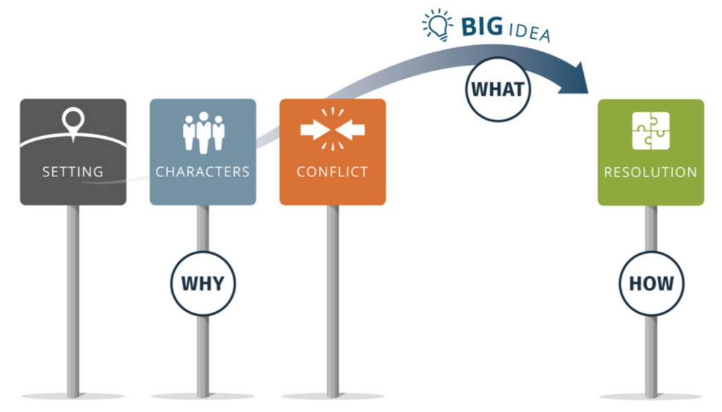
Setting: The setting builds context and helps get everyone on the same page by emphasizing what is happening in their world (and gives them a reason to care). Think of it as a mini-education that shines a spotlight on issues you (and hopefully your audience) want to solve.
Characters: Why are characters so irresistible? Simple: because we are human, so “meeting” a character in a story feels familiar to us. It helps to serve a critical function in stories by presenting who or what matters to your audience. Characters can be named (“meet Ben”), unnamed (“Consumers”), or YOU (think of a TED Talk where someone puts themselves in their speech). And just as your audience begins to care about your characters, your story needs to convey that something is happening to them. You need conflict.
Conflict: Conflict in your story is a significant differentiator between super-exciting and utterly forgettable. Without some form of conflict or tension, your story has no momentum. Conflict gives your audience further reasons to care because it reveals the challenges they’re facing. Revealing it lets you be a hero twice –first when you identify a problem, and then again when you propose a way to fix it.
BIG Idea: In every great story, you’ve established context through setting and characters. You’ve built-in uncomfortable conflict. You’ve got your audience to care. Now is the time to add a BIG Idea –the one thing you want your audience to remember. Your BIG Idea acts as a mental bridge to help bring your audience through the conflict and accept your resolution.
For example:
We need to invest more in our partners must get intentional about cross-border shoppers it’s time to pause and rethink our approach
Resolution: A strong resolution brings your characters – and your audience –safely through the conflict. It’s the “meat and potatoes” of your story. For a salesperson, it’s the features and benefits of their solution. For a product manager giving an update, it’s their recommendation to spur product growth.
But often, in our eagerness to solve the conflict quickly, most people start with the resolution at the beginning of the story. In fact, starting with the resolution is the opposite of good business storytelling. Can you imagine if The Wizard of Oz started with “there’s no place like home”? We lose all the setting, characters, and conflict that got us engaged with the story. We care because we went on a journey with Dorothy.
You must build context for your audience, including some healthy tension, so they have a reason to care. Otherwise, they will not be motivated to hear the details of your resolution. Your resolution must be earned.
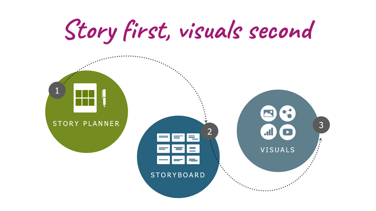
Remember: Story first…
And so there you have it. Before jumping into your visuals, remember to follow this baseline story structure:
- Follow the four signposts to explain WHY your audience should care (Tip! The first three can go in any order, but resolution should always come last)
- Have a BIG Idea (that captures the WHAT of your story)
- Reveal your resolution (which details the HOW of your features, solutions, or recommendation)
…Visuals second
And now the fun begins – the visuals! Remember, there are five basic ways to visualize your story: photos, diagrams, data, videos, and text (yes, event text can be used as a visual element!). Use them strategically to link to your narrative with purpose to get people to notice and, more importantly – respond to – your ideas. For help, check out our quick and easy guide for choosing the best visuals for your next presentation.
Photos: Pictures are infinitely more memorable than text because they help connect with your audience on an emotional level. They’re also useful in creating a mood or theme for your presentation — particularly if you are presenting data or facts about people.
Diagrams: Diagrams are great for clustering information into digestible concepts using shapes and colors. They can be a great alternative to overused charts, tables, or timelines to call out your key message.
Data: Data is most often presented in the form of traditional charts and tables. However, don’t be afraid to think outside the chart by using a combination of oversized numbers, text, and basic shapes to draw the eye to key data insight and advance a story forward.
Text: Believe it or not, the text is the most commonly visual. Unfortunately, it’s wildly overused. Since popular programs (like PowerPoint) default to bulleted lists of text, we often create slides that are jammed up with words, making it difficult to quickly scan and digest. But text can work very well when used sparingly with contrasting colors and sizes. Video: Video can help set the tone for your story’s opening, bring your characters to life, or provide a dramatic close that reinforces your BIG Idea. It’s best kept brief and, of course, totally on message.
Visual storytelling: The most powerful way to spread your ideas
Want more advice on how to use visual storytelling to help you cut through the noise? Check out our best-selling book Everyday Business Storytelling for practical tips and real-world examples designed to help anyone learn the art of crafting persuasive communications.