
We understand that presenting data in PowerPoint can be a daunting task, especially when you don’t have time to get creative. Here are 3 easy tips for presenting data effectively when you’re short on time:
1. Make your slide title a news headline
Every journalist knows that if your headline doesn’t reflect your story’s juice, readers will surely overlook your article. Well, the same principal applies for presenting the “story” of your data. To immediately engage your audience, create a headline that reflects your single most important piece of information.
Elevating your most important message to the headline (a.k.a. the slide title) has two advantages:
- It makes your data memorable
- It makes your audience lean in and want more information.
Yes, it’s that simple.
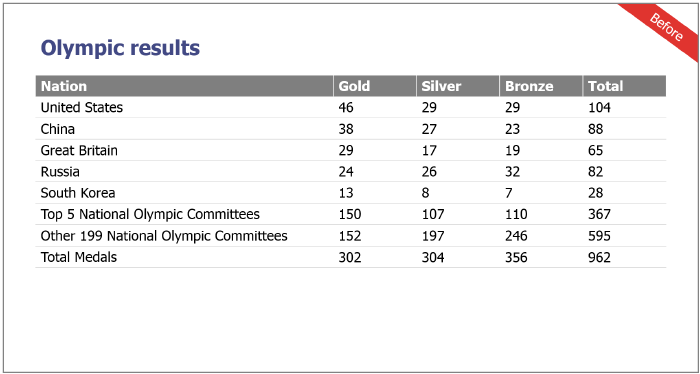
Take a look at the generic headline in the slide below. Notice: in order for the audience to learn anything more about the Olympic results, they have to squint their eyes and wade through rows and rows of data. Why make it so difficult?
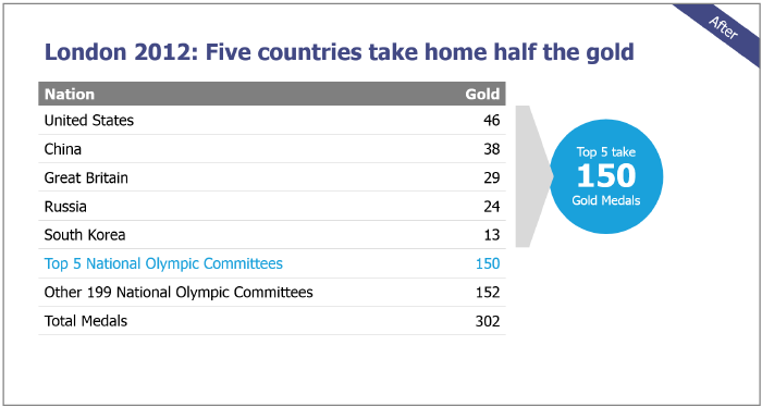
Here is the same data presented with an active, content-rich headline that tells us upfront what the big news is right away. Unlike the above slide, it doesn’t make us work hard to figure out the message:
If you’ve ever used the words “comparison” or “overview” as a headline for your charts, we are talking to you! While there might be occasional need for broad language, you are probably missing an opportunity to give power to the message within your data. Try asking yourself: where is my key message? What is this slide about? If you can’t answer this question in the title, then this could be a red flag.
Bonus tip: Whenever possible, the title should include a unit of measurement and a time period to give the audience context.
2. Use callouts to pinpoint your main message
Callouts are simply an added shape that stands apart from the chart but draws attention to the chart’s key message. Callouts are married to the headline. They work together to illuminate the main message. While the headline tells us the most important nugget of information in the chart, the callout points right to it.
In the “after” slide above, the callout is the blue circle to the right of the chart. It points out the exact same message as the headline. Again, both the headline and the callout reinforce each other and the main message of the slide.
3. Color controls eyeballs
Color is the easiest way to differentiate the critical data point (that carries your main message). This is where you want eyeballs to go first. As you see in slide 2 above, it is best to go with a monochromatic color scheme that is clean and simple. When you add a simple contrast color to one data finding, you illuminate it immediately. Your audience will see your main message in one glance.
Although color itself doesn’t add meaning or value to your data, its presence makes a big impact. Consciously or not, when people look at a data display and see visual differences like color, they immediately try to determine the meaning of those differences. Too much color will confuse your message (a very common problem). Used sparingly, color is a great tool in telling your story.
Remember: Your audience will remember four slides in a 20-slide presentation. Make them count.
Want more simple yet powerful tricks for making your data pop? Check out our Ultimate Guide to Data Visualization vs. Data Storytelling or contact us about our Data Visualization workshop for teams!