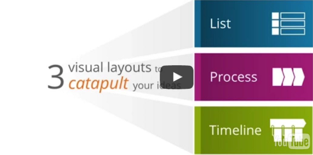
It’s no secret — it’s the visuals that get your message heard and retained. Pictures are processed 60 thousand times faster than text. Here are three common visual layouts that work to catapult your ideas.
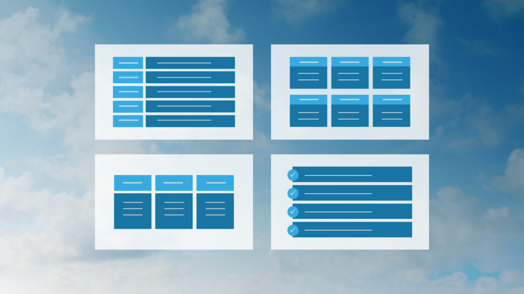
Let’s begin with a simple list. Not exactly a major work of art. But sometimes, it’s all you need. If you can’t keep it short, try a different layout.
Here are some examples of how to display a list. Notice how each item is encased in a box. And boxes are placed in regular patterns. No one item has more weight than another but it brings graphical life to the simple list.
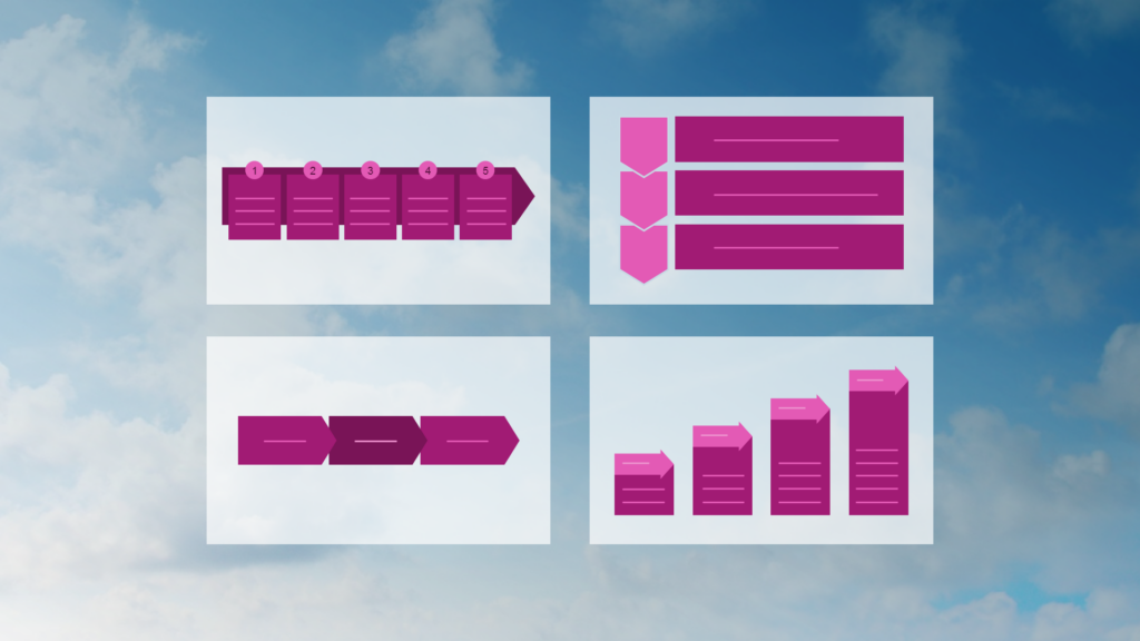
Next up, a process. Unlike a list, a process shows sequential information. Look for directional arrows to flow from one item to another. This visual is all about order. Add numbering to really make your point.
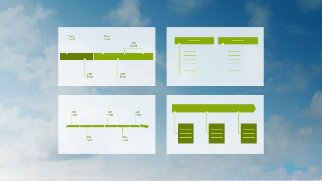
Which brings us… to timelines. Timelines display events in chronological order. More visual than a bulleted list of dates.
So, goodbye endless text. Goodbye bullets. Think visually about your presentation design to really drive the message home.
Looking for a slide library that contains nearly 100 slide layouts in your company’s brand? Look no further.
Participants of our Influencing with Visuals workshop receive a Visual Slide Library™, featuring branded slide layouts (photos, diagrams, data visualization, text displays and more). It also includes how–to PowerPoint instructions for editing slide layouts.