We all know that telling a story with our data is what gives it meaning. But sometimes, it’s difficult to know how much data to include. We have a simple way to determine what’s worth including…can you give this chart a meaningful headline? Does it move forward the story you want to tell?
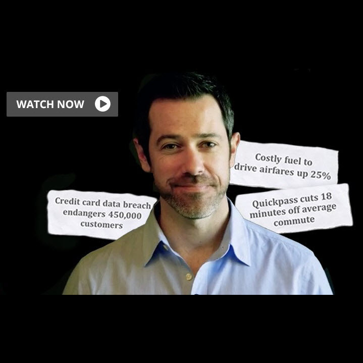
Headlines are the best way to put a spotlight on what your audience needs to know. This quick video will help you think of data not as a pile of numbers but as important “news” you will report. Check it out here:
Our data visualization workshop helps teams convert data into valuable insights that accelerate decision-making. Click here to learn more.
