
If you’ve ever had to present data, you’ve undoubtedly wondered about what visuals to use. Beyond making your data look great, you want it to be easily editable and, most importantly, actually MEAN something to your audience.
So our pros pulled together their top tips for choosing the perfect chart for the next time you’re designing data visualizations:
Tip # 1: Just Say No To Eye Candy
Colors
Darker blues, greens and oranges are best. Avoid yellows and neon colors, as they typically do not project well. Use red to highlight or call attention to a key message. Avoid 3D effects.
Lines
Be careful with dashed and dotted lines. Instead, use different colored solid lines.
Fonts
For best viewing in a medium-sized room, use a minimum of 18 pt font. Use your PowerPoint default font; avoid Times Roman, narrow fonts, or fonts with serifs.
Legends
Legends are used in charts with more than one data series. They should not be placed on the outside of the chart in a way than reduces the plot area, the amount of space given to represent the data.
Labels
A chart that labels the value of each individual data point does not need labeling on the y-axis. If it seems necessary to label every value in a chart, consider that a table is probably a more efficient way of presenting the data.
Titles
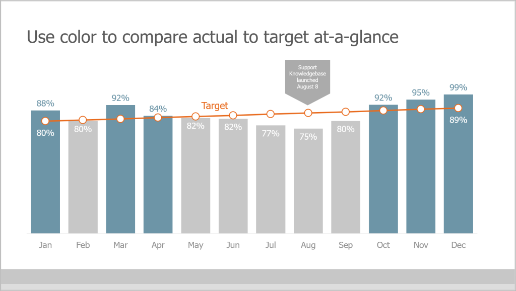
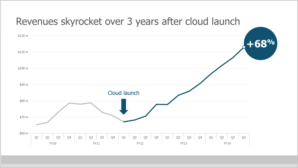
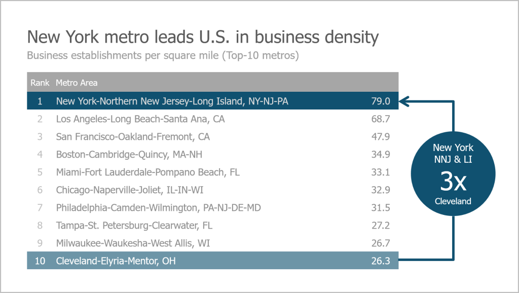
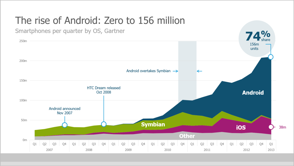
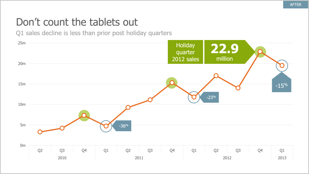
What is the one thing you want your audience to remember about your chart? Make that your PowerPoint slide title. Avoid passive titles, such as “Annual Sales” or “Percent Trained”. Instead try titles that are conclusions: “Annual Sales Beat Expectations” or “Employee Safety Training Lags in Department XYZ”.
Gridlines
If they are used at all, use subtle colors, like a soft grey and don’t let them overwhelm the other graphical elements of the chart.

Tip #2: Choose a Chart That Tells A Story
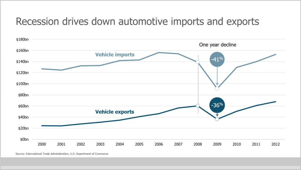
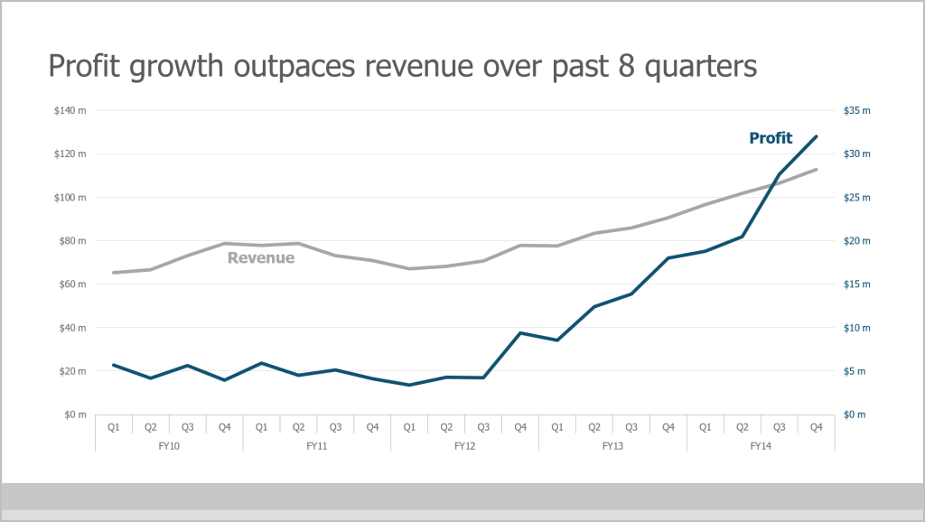
Line graphs show changes or relative changes to something over a period of time. Use a maximum of 5 lines per chart for easiest viewing and understanding.
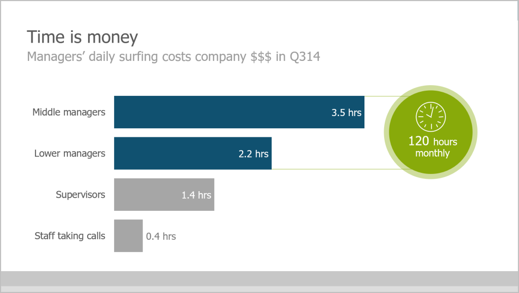
Bar graphs display a relationship between variables, usually for the purpose of comparison. Keep them two dimensional for ease of viewing. Bar color and outline should be the same color.
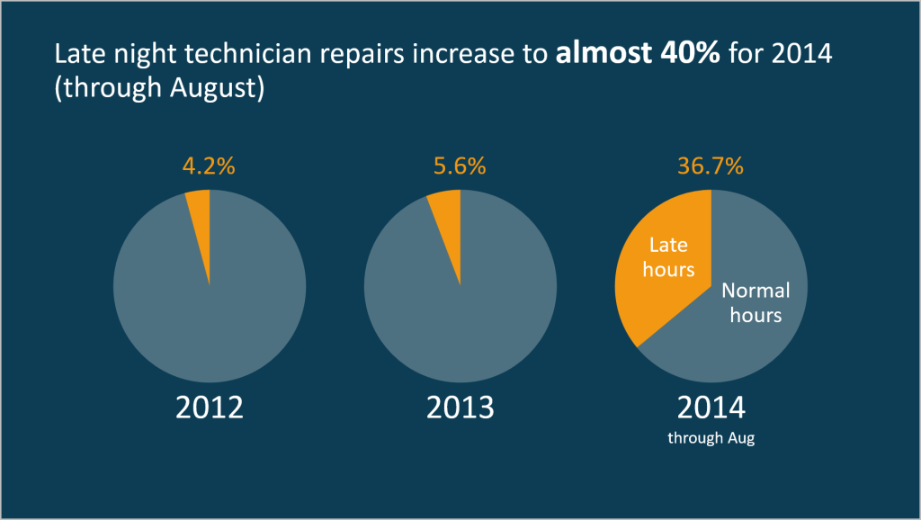
Pie charts show how percentages relate to each other within a whole. Use a maximum of 6 wedges per pie. Use pie charts only for data that add up to some meaningful total.
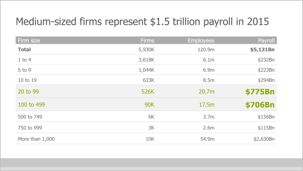
Tables display data details that would be lost in graphs or charts.
Tip # 3: For Best Results, Use “Insert Chart”
Instructions
1. From your Excel worksheet, copy just the data you wish to show on your PowerPoint slide
2. In PowerPoint, insert a new slide and choose the Title and Content layout
3. Select the Chart icon (see Tip #2 for help on choosing the right chart)
4. Insert Chart dialog box appears
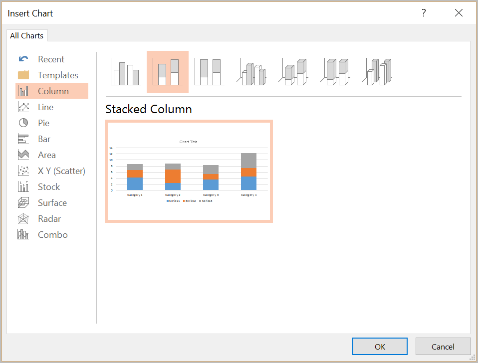
5. Select chart type then click OK
6. Paste data into the worksheet that appears then close the worksheet

Benefits of Insert Chart
- Keeps chart colors consistent with your presentation design
- Maintains confidentiality of your original Excel worksheets
- Reduces PowerPoint file size
Want to learn more about TPC’s data visualization workshops for your team or company? Take a look at our Presenting Data Visually workshop page.