Presenting Data Visually


Turn your data into stories that drive action

Ever found yourself drowning in spreadsheets, wondering how to make your audience care about your numbers? You’re not alone.

We see it everywhere: talented professionals armed with compelling insights, yet their data gets lost in what we call Frankendecks — cobbled together charts and graphs that lack a clear, cohesive narrative. The result? Audiences struggle to decode information, decision-makers lose interest, and valuable insights go unrecognized.

Here’s the reality: most of us start with the pretty—the templates we’ve been given, the slides we’ve been told to include. We jump straight to creating charts and data visualizations without first establishing why our audience should care.

The problem isn’t your data—it’s your approach

Every memorable presentation tells a compelling story, and data presentations are no exception. The most successful ones don’t start with charts—they start with story.

Because when data lacks a narrative thread, business suffers:

Presenting Data Visually

Data overload stalls decision-making. Teams present overwhelming amounts of information without clear insights, forcing executives to draw their own conclusions during critical meetings.

Presenting Data Visually

Additional meetings and rework cycles drain efficiency. When data presentations lack clarity, teams spend valuable time in follow-up meetings re-explaining findings rather than moving work forward.

Presenting Data Visually

We report the news instead of driving action. Information becomes data dumps rather than strategic narratives that influence outcomes.

Presenting Data Visually

Technical expertise isn’t translating to business impact. Teams struggle to communicate complex findings in ways that resonate with leadership and drive investment.

Presenting Data Visually

Time is wasted explaining charts rather than having productive conversations.  Stakeholders aren’t sure what they need to know or do with the information being presented

You need a data strategy rooted in storytelling

Whether we’re aiming to influence a decision, propose a new initiative, or report on performance, we rely on data. But data on its own is not an idea. There’s usually more data than there is clarity and, instead of supporting our message, we force our audience to decode it and draw their own conclusions. 

A story first, visuals second mindset can change everything

Our self-paced, on-demand course, Presenting Data Visually, helps you move from “big data” to “big understanding.” You’ll learn how to cut through the noise and visually communicate clear, concise, and meaningful data insights that serve your narrative—not the other way around.

Whether you’re a data expert struggling to influence leadership or an occasional data presenter who wants to make every number count, this course will arm you with simple yet powerful data visualization tools and techniques. You’ll shift from data dump to data fluency, ensuring your insights drive the business conversations that matter.

What you’ll learn

After completing this course, you’ll be able to:

  • Apply a proven four-step data visualization strategy that distills complex information into clear, digestible insights
  • Identify exactly what your audience needs to KNOW or DO with your data
  • Use clever design techniques that elevate your data story
  • Transform cluttered charts and tables into concise and compelling visualizations
  • Leverage our Data Visualization Library—a suite of 100+ professionally designed templates with inspiration, pro-tips, and coaching examples

What to expect

This isn’t a passive learning experience. You’ll:

Presenting data visually

Watch bite-sized videos featuring TPC’s expert instructors

Presenting data visually

Practice with hands-on activities using your own real data

Presenting data visually

Get guidance through our DataCoach™ and DataCheck™ tools

Presenting data visually

Apply what you’ve learned to transform your own data-rich slides

Plus you’ll earn a certification and badge to showcase your new skills Presenting data visually

Presenting Data Visually

Your investment

This course is designed to be consumed at whatever pace works for you. We recommend that you allow 3 to 5 hours of total time to complete the course and that you complete it within two weeks. To get the most out of the course, we suggest allowing extra time to practice and apply the exercises as you go. 

Pick your path!

This course will show you how to efficiently build data visualizations in Microsoft PowerPoint and Google Slides. No matter which you use (or if you dabble in both), we’ve got you covered!

The transformation is real.

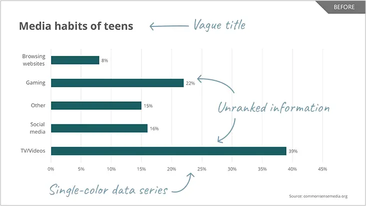
Before:  Vague titles, single-color data series, and unranked information leave audiences confused and struggling to find insights

Presenting data visually

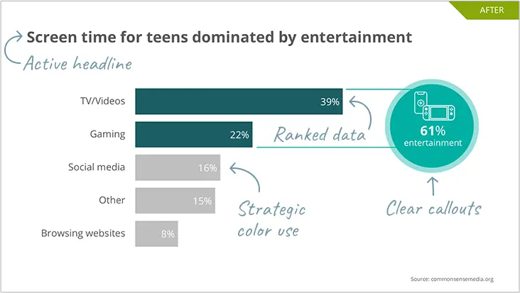
After: Active headlines, strategic color use, ranked data, and clear callouts make your key points instantly visible

Presenting data visually

What our participants say

“This class was a game-changer. Now I wish I could get back those years I wasted building lackluster charts in PowerPoint!”

— Presenting Data Visually participant, General Mills

Very practical tips and resources that will save me time when trying to visualize the insights that we’re getting from data.”

— Presenting Data Visually participant, Medtronic

This is one of those courses you don’t come across often. The content can be utilized in your day-to-day work instantly and effectively.”

 Presenting Data Visually participant, Meta

Ready to turn numbers into narratives?

Don’t leave it to your audience to decode your data. Learn to create data stories that inspire action and drive business forward. Enroll in Presenting Data Visuallytoday! 

Price: $599 USD

Interesting in bundling Presenting Data Visually with our other digital, on-demand courses?